
Thank you Reading. Berkshire, not books.
Story 220: Celebrating Climate Stripes

You will have seen these stripes. You may know what they represent. You may not know why, or how, they came into being. Here’s Professor Ed Hawkins from the University of Reading to explain what happened in 2018.
Welcome to Barnes2050, a place-based futures project asking: how do we make sure Barnes - the place and its people - is thriving and climate-ready by 2050?
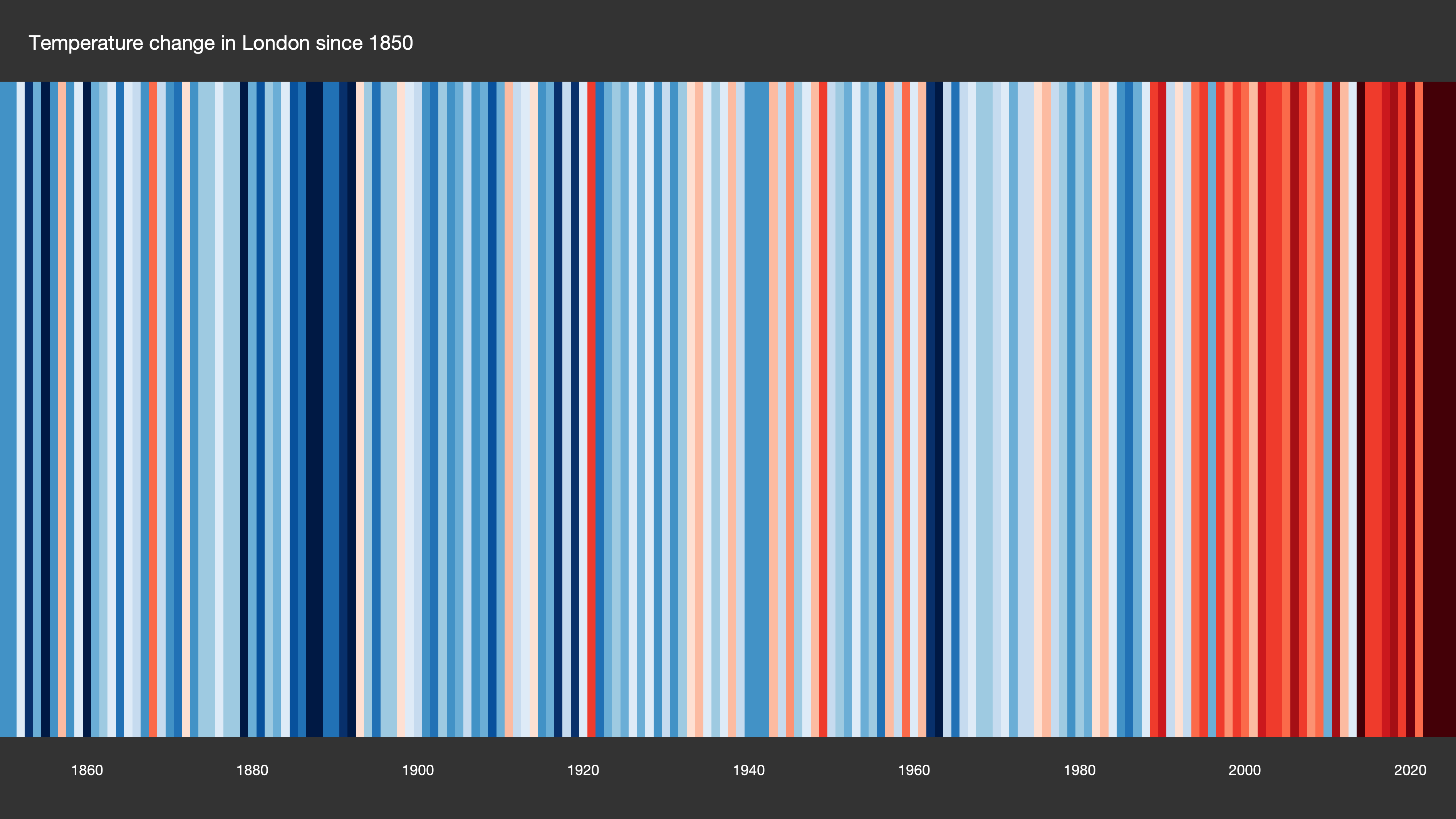
The warming stripes show how a place’s temperature has changed over time. Each stripe represents a year. Cooler years are shown in shades of blue and warmer years in shades of red, with paler colours representing years closer to the long-term average.Here’s London’s stripes since 1850:
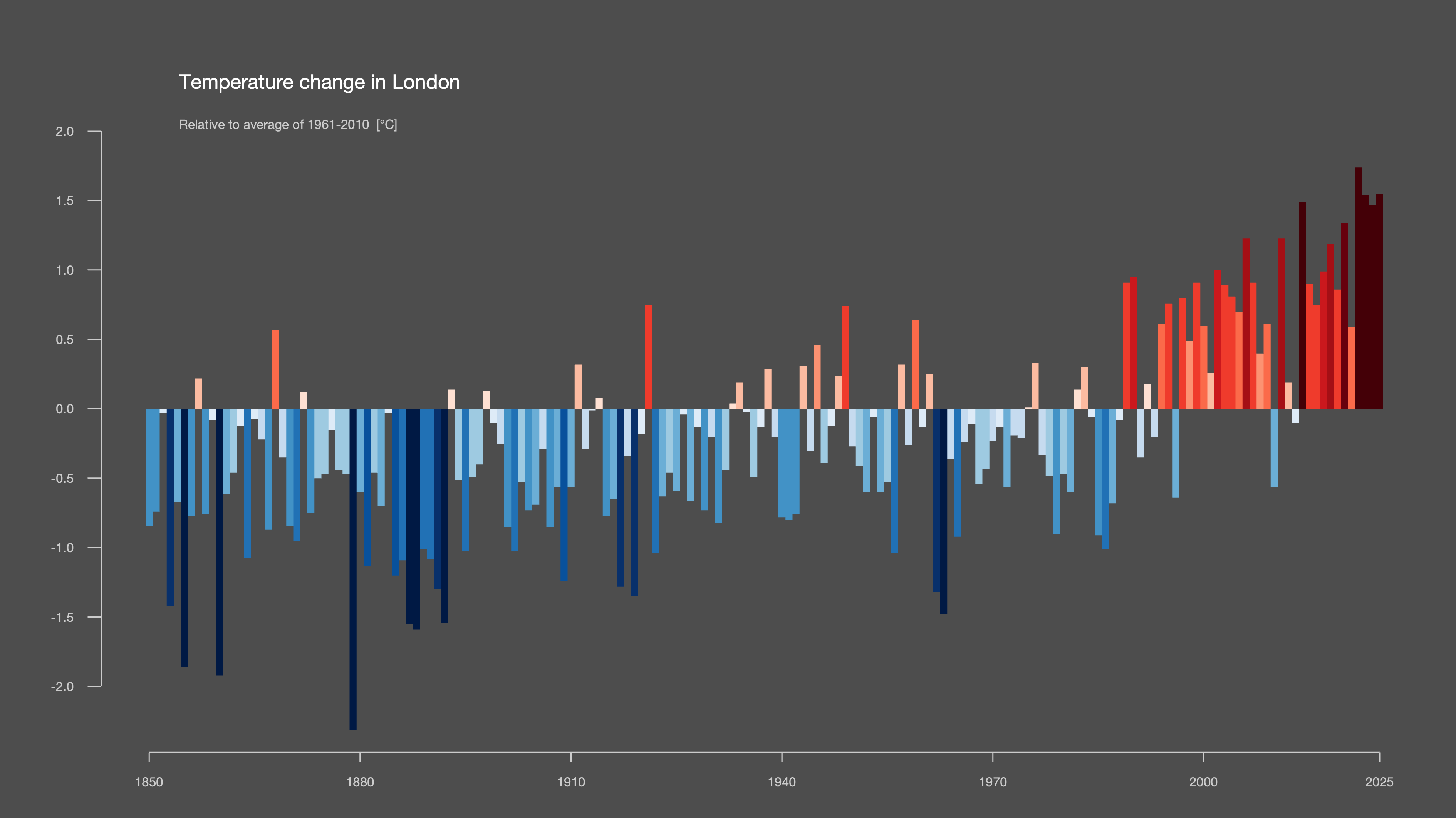
And here’s the data behind those Climate Stripes.
Notes and thoughts
I became climate curious because I worked with a team of media technology researchers. Others will have arrived by different routes. For some, I suspect, it was the climate stripes.
They’re a reminder about the power of visualisations. Vivid. Compelling. They pull you in.
What was the temperature in the year of my birth?
What was it when I was 18 years old?
Perhaps that’s the real lesson. Sometimes you don’t need more data. You need a better way of seeing it. Curiosity does the rest.
More useful resources
The climate stripes are one small part of the University of Reading website. There’s plenty there for the general reader including a useful summary about the IPCC and guidance on short online courses.
You can generate climate stripes for anywhere in the world by visiting Professor Hawkin’s website, Show Your Stripes.
You can read more on the effects of heat on Barnes, now and in future, here.